Discovery
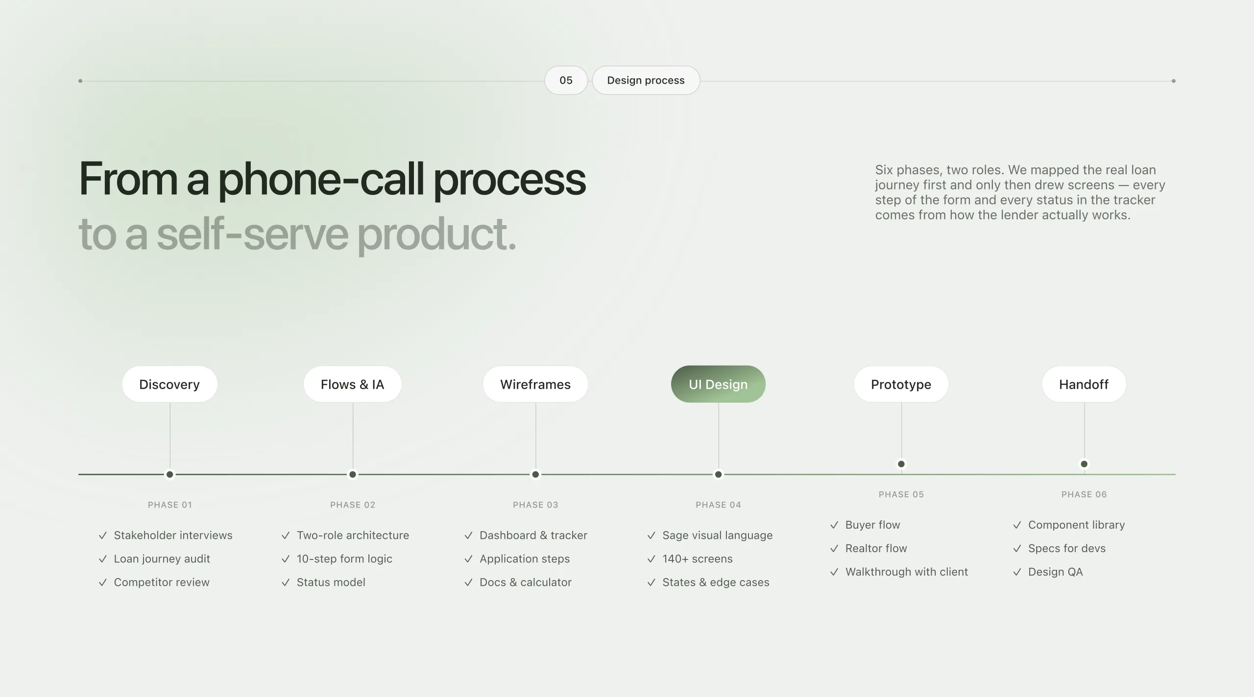
Stakeholder interviews, an audit of the real loan journey and a competitor review showed where buyers and realtors lost time to calls, emails and attachments.

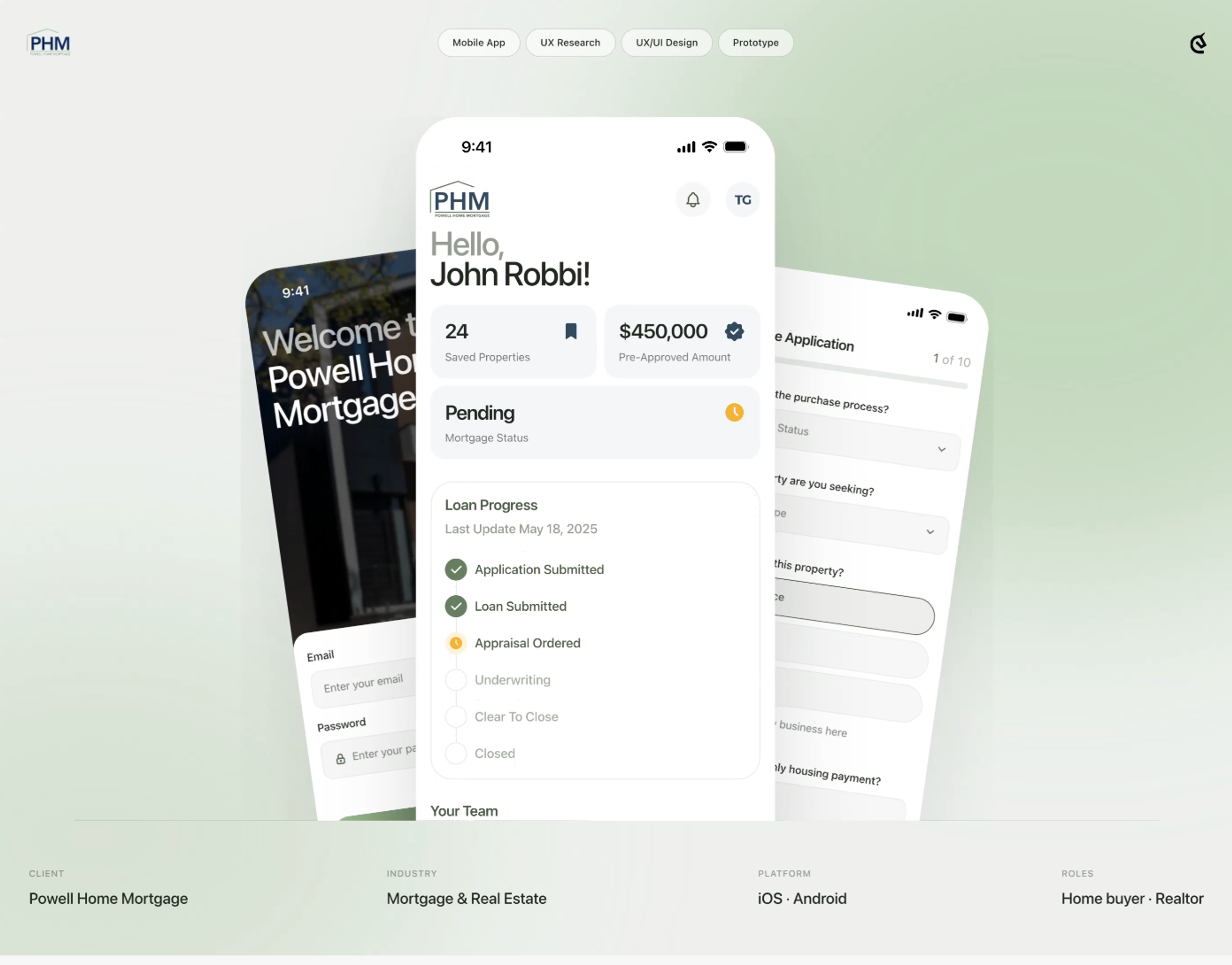
A mortgage is the biggest purchase of a life, and the least visible one. We turned it into one app where buyers always know the next step and realtors never chase a status by phone.
UX research, UI design and prototype for Powell Home Mortgage, a US residential lender working with first-time buyers, growing families and the realtors who refer them. One native app with two roles inside: a loan journey for buyers and a client pipeline for realtors.
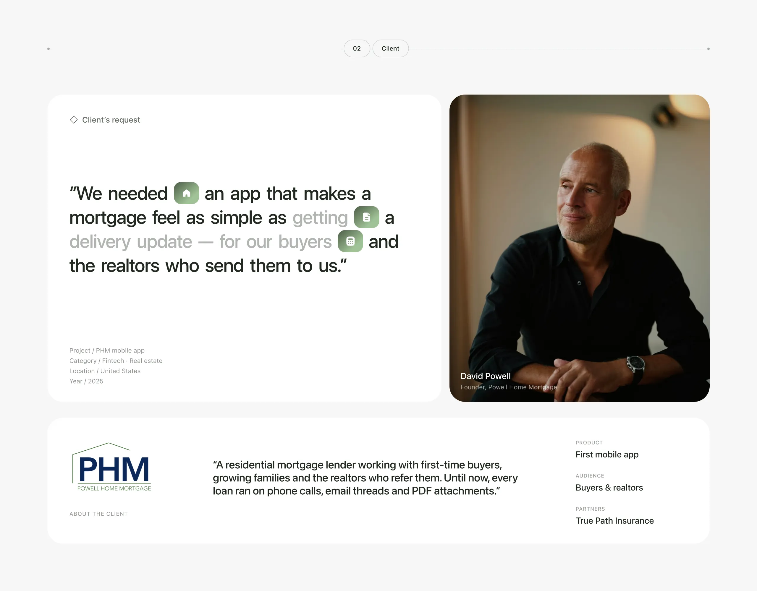
Powell Home Mortgage asked us to design its first mobile app, one that makes a mortgage feel as simple as getting a delivery update. It had to work for buyers and for the realtors who send buyers to the lender. Until then every loan ran on phone calls, email threads and PDF attachments. The brief covered the full journey on iOS and Android: sign-up, a live loan tracker, the full Form 1003 application, document uploads, a mortgage calculator, saved homes, appointment booking and a separate realtor view of every client.
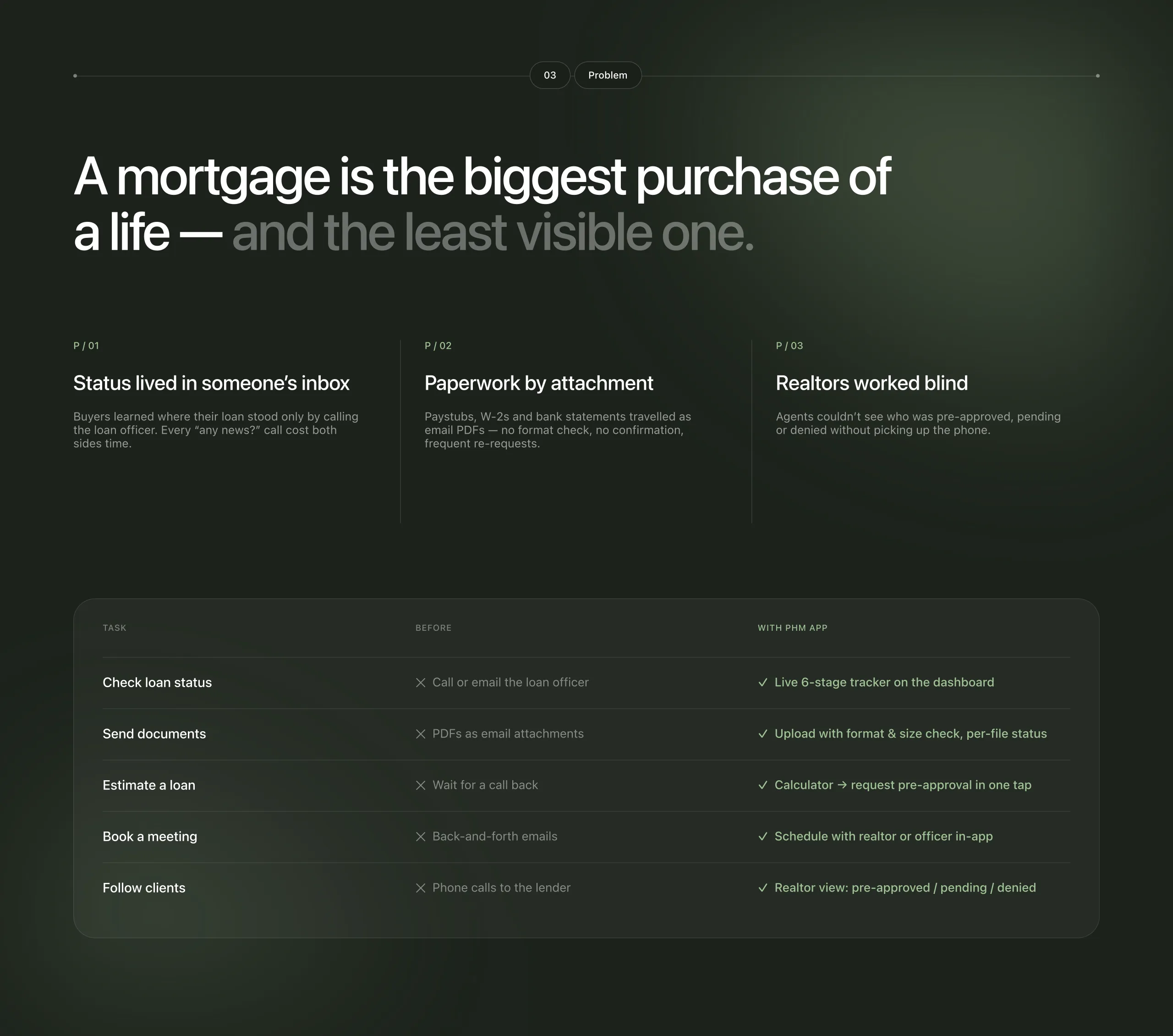
Buyers could only find out where their loan stood by calling the loan officer, and every “any news?” call cost both sides time. Paystubs, W-2s and bank statements arrived as email PDFs with no format check and no confirmation, which led to frequent re-requests. Realtors couldn’t see who was pre-approved, pending or denied without picking up the phone. Research led to one insight: buyers don’t need more information, they need one answer to “what happens next?” The status mattered more than the detail, documents caused the most anxiety, and realtors turned out to be a second customer who needed the same visibility.
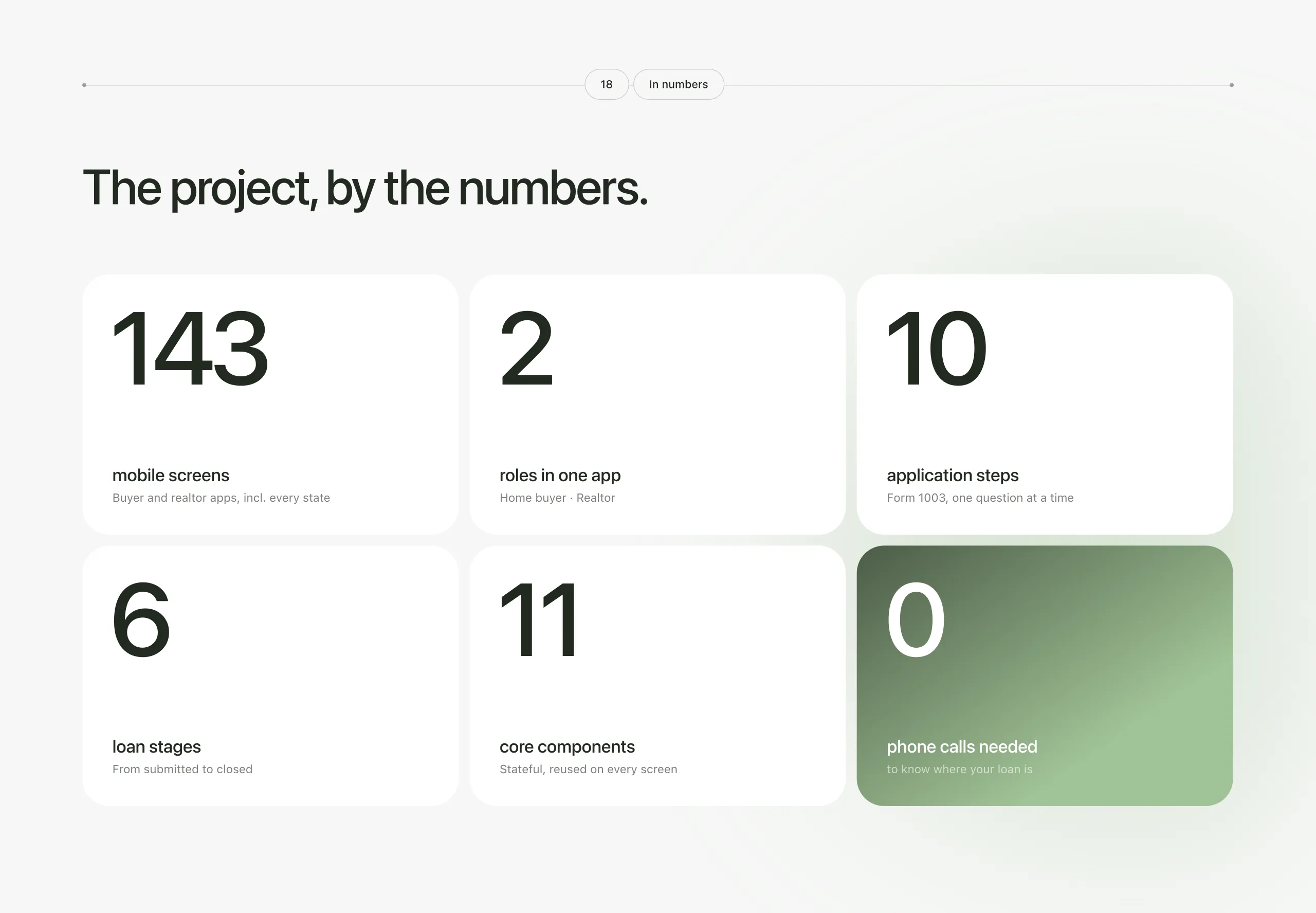
One app with one login and two roles, so buyers and realtors see the same status. A live six-stage loan tracker on the dashboard replaced status calls. The lender’s long Form 1003 became ten short steps, one question at a time. Each required document now has its own card with accepted formats, live upload progress and a one-tap retry. A calculator shows the monthly payment and leads straight to a pre-approval request. Realtors get their own pipeline with live statuses, downloadable pre-approval letters and an invite link for new buyers. The whole app runs on 143 screens built from 11 stateful components. Buyers now need no phone calls to know where their loan is.
Stakeholder interviews, an audit of the real loan journey and a competitor review showed where buyers and realtors lost time to calls, emails and attachments.
A two-role architecture behind a single login. We wrote the logic for the ten-step form and modelled the six loan statuses before drawing a single screen.
Dashboard and loan tracker, application steps, the document centre and the calculator, mapped from how the lender actually works.
A calm sage visual language on SF Pro: sage for actions, ink for reading, colour only where it means something. 143 screens, including every state and edge case.
Buyer and realtor flows walked through with the client. Then an 11-component library, development specs and design QA for a clean build.

Book an introduction call
During this call we do a quick intro and discuss your project and its specific needs.
Book an introduction call
During this call we do a quick intro and discuss your project and its specific needs.

Let's talk about your project
Book a free consultation with us, so we will frame your product vision and strategy.
hello@u1core.com
FREE E-BOOK
We want your Web3 website to be great even if you don't hire us.

Thank you for reaching out!
We’ve received your request and our team is already reviewing it. We’ll get back to you as soon as possible to discuss how we can help you achieve your goals.
Looking forward to collaborating with you!

Thank you for your interest in our Web3 eBook!
We’ve sent the download link to your email. Check your inbox (and spam folder just in case) to access the eBook.
We hope you find it valuable for your Web3 journey. If you have any questions or feedback, feel free to reach out!